State of Washington Recreation and Conservation Office
Grant Management System
Rudeen & Associates, an information systems consulting firm, was working on a prototype for rebuilding the Home page for RCO’s PRISM, a web application for managing project grants. In developing this prototype and reviewing it with their client and users, they discovered a number of usability issues in the application home page. They looked to our design team’s user experience expertise to come up with solutions to solve these issues.
Challenge
On a tight timeline, redesign the PRISM home page experience to address the usability pain points caused by trying to satisfy both user types on the same screen
Solution
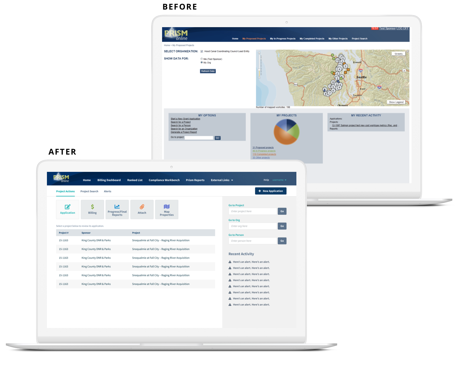
Analyze the user goals and customize the experience for each user group, creating one screen with quick actions for infrequent users and a separate screen for power users’ extensive data search and filtering

Palador added excellent design skills to our web application team. With good listening skills, thorough analysis of uses and navigation, and attention to each design detail, they provided several workable options and helped guide us to an elegant solution. Their UI/UX design skills are so good!
Diane Stinson Rudeen, Founder @Rudeen & Associates

How We Did It
Our design team worked closely with the key stakeholders at Rudeen & Associates to pinpoint the specific use cases, finding that there were two main user groups with separate needs. Realizing that the majority of usability issues were being caused by forcing one experience for all, we provided a solution that customized the experience for each respective group.
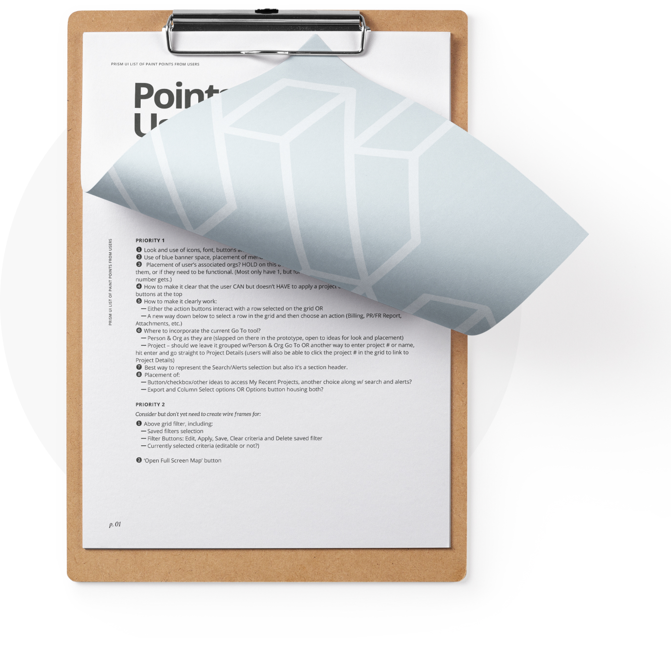
Usability Pain Points
Addressing issues for each user group
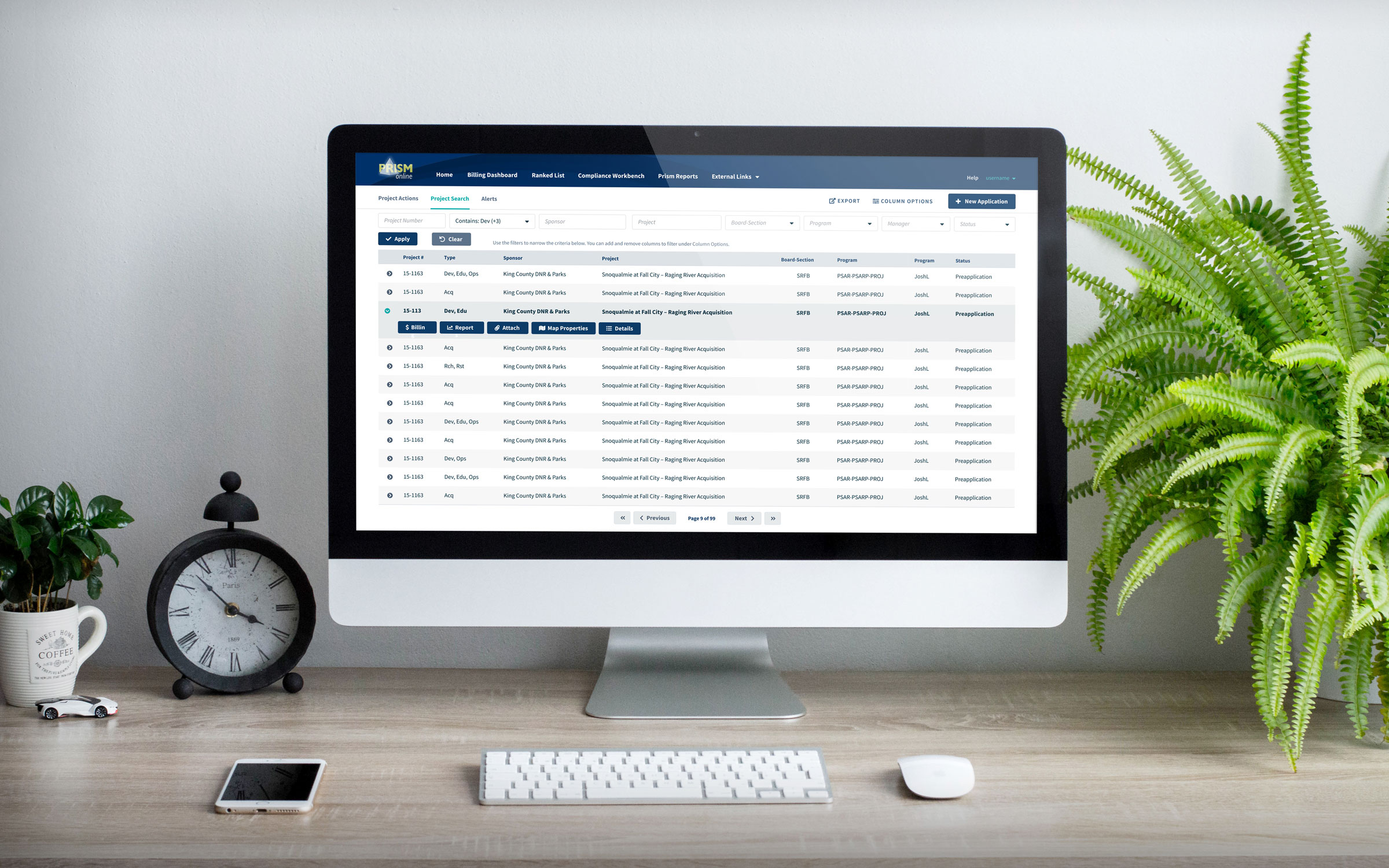
Analyzing and prioritizing the use cases, we found they could be divided into two separate experiences. Infrequent users or project sponsors knew they had specific tasks to do but couldn’t remember the project and could benefit most by accessing “quick actions” for projects that were relevant to them for each action. Grant managers or power users instead needed to sort through detailed project data for multiple projects, so we overhauled the complex and unwieldy filtering system for optimal data consumption.

Visual Design Overhaul
Modernizing the visual styles
During our analysis of PRISM, we found that not only did the application look archaic, but the lack of visual hierarchy presented another usability struggle. We removed the harsh gradients and dated effects, chose an open source typeface family appropriate for data-heavy user interfaces, and tweaked the colors to increase contrast and appeal. In addition, we provided an HTML/CSS template to make it easy to use the new styles.


