Guidacent
guidacent.com
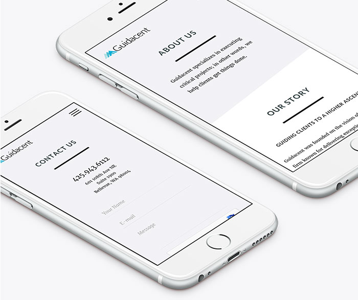
We were approached by Guidacent, a Pacific Northwest consulting agency with a focus on solution delivery, to refresh its public facing website. Stale with minimal call-to-action and clunky on mobile, their current website was not optimized to attract new clients and new hires. With execution being at the heart of their business model, we worked with key stakeholders to get their digital presence up to par with their standards of high end results.
Challenge
Design and develop a responsive website with a fresh point of view, clear direction, and optimized UX that would entice both potential clients and potential consultant hires, using a CMS that would be easy for non-technical users to update content
Solution
Re-brand guidacent.com with a new visual identity that encompasses a high-end, crisp, and modern feel, restructure the site map and content to match ideal use cases for our documented personas, and develop WordPress templates for easily editable content

How We Did It
Through intense collaboration with Guidacent, we considered how our client’s strengths could stand out by streamlining the UX. Starting from the ground up, we arrived at a solution that was simple in both look and execution.
Visual Design Identity
Crafting a new design language
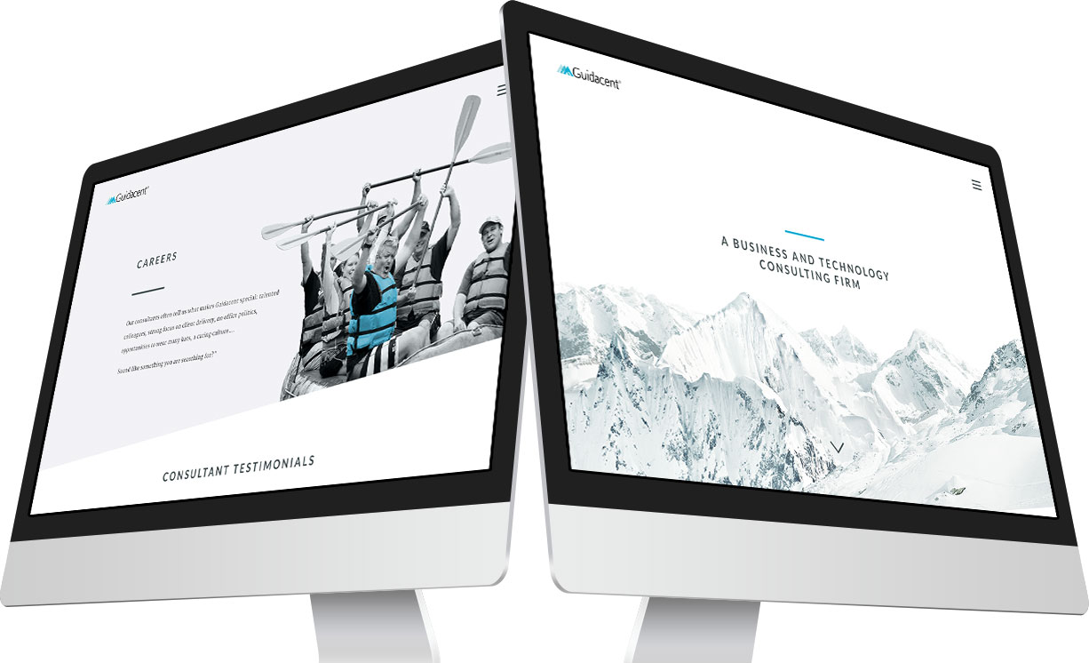
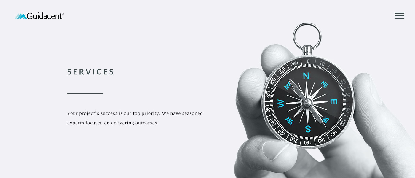
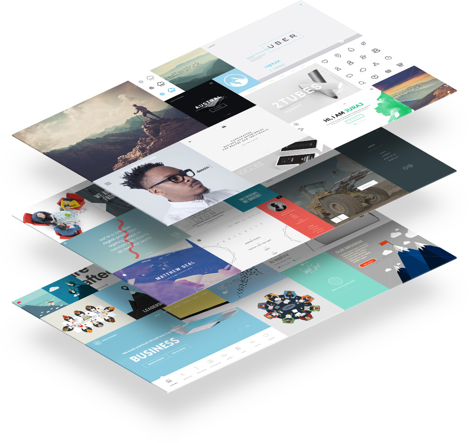
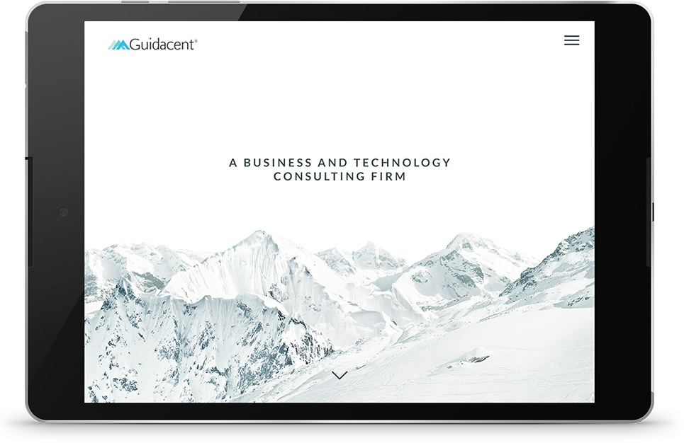
Working closely with stakeholders at Guidacent, we found their goal was more high-end, a little edgy but professional, adding feelings of freshness and clarity. They also wanted to incorporate mountains, part of a metaphor close to their brand. Our goal: forward-thinking, sophisticated, crisp. We used a high contrast monochromatic color palette accented with “Guidacent” blue, choosing a focus on typography with line embellishments and ample white space. The overall effect was pragmatic minimalism with a crisp, wintery feel.
Restructured Content
Making decisions based on users
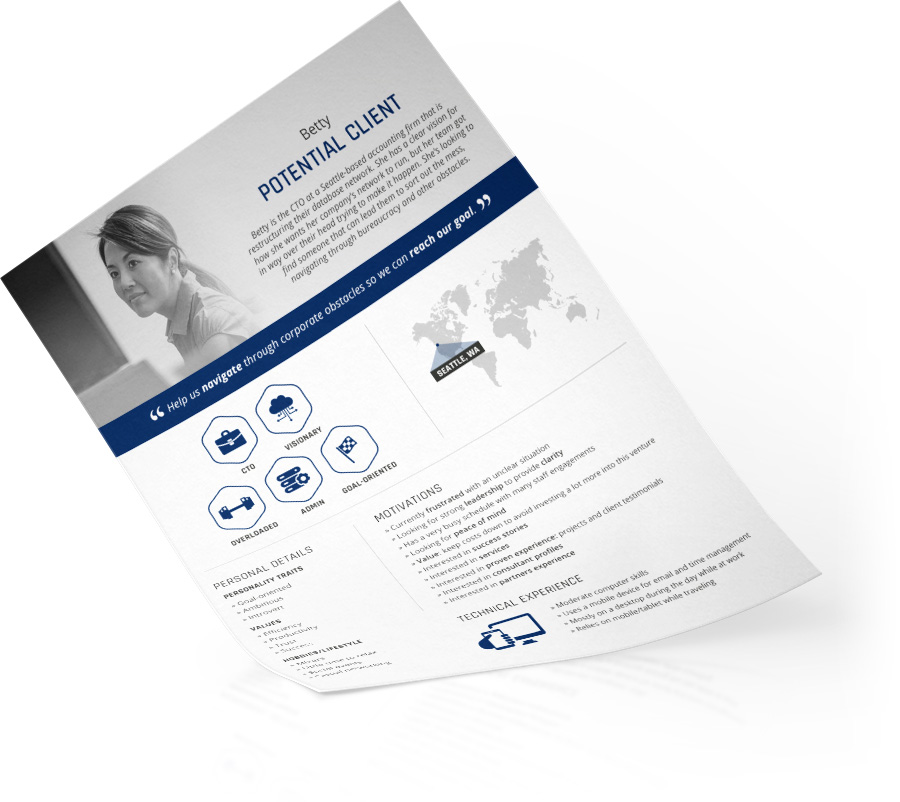
With a very busy and preoccupied core audience, it was imperative for information to be quickly and efficiently found. Employing our user personas, we prioritized use cases and defined user expectations. Going through the content that Guidacent wanted to incorporate, we matched their strengths with site visitors’ needs. We took it all apart and put together a new site map based on ideal user flows.
Interaction Design
Modestly flashy in all the right places
Guidacent wanted to do something a little trendy, but they wanted to keep a modest appearance since that was in line with their customers’ values. We decided to add detail to the minimal, sleek design via the interactive elements, employing current design trends such as parallax scrolling and micro interaction animations. This attention to detail also helped make the design feel more high-end.
Outcome
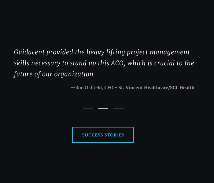
Palador did an excellent job listening to our needs and created a sleek, modern website for us. We continue to get frequent compliments on the design and elegant simplicity.
Jon Fleming, Managing Director, President @Guidacent

