Cyber Independent Testing Lab
cyber-itl.org
The Cyber Independent Test Lab (CITL) is a nonprofit research organization that uses scientific data to advise consumers about software security. Addressing a lack of industry standards for measuring and testing security, they independently quantify risks of various software. The data in their reports was overwhelming to most people outside of industry experts, but they wanted the information to be accessible to the average consumer. Their goal was to become the “Consumer Reports” of software security, providing the facts for people to make smarter choices so the industry can be safer.
Challenge
Address information overload and organize complex data so that it’s not confusing, while providing a new website to house the new reports and brand that supports their mission statement
Solution
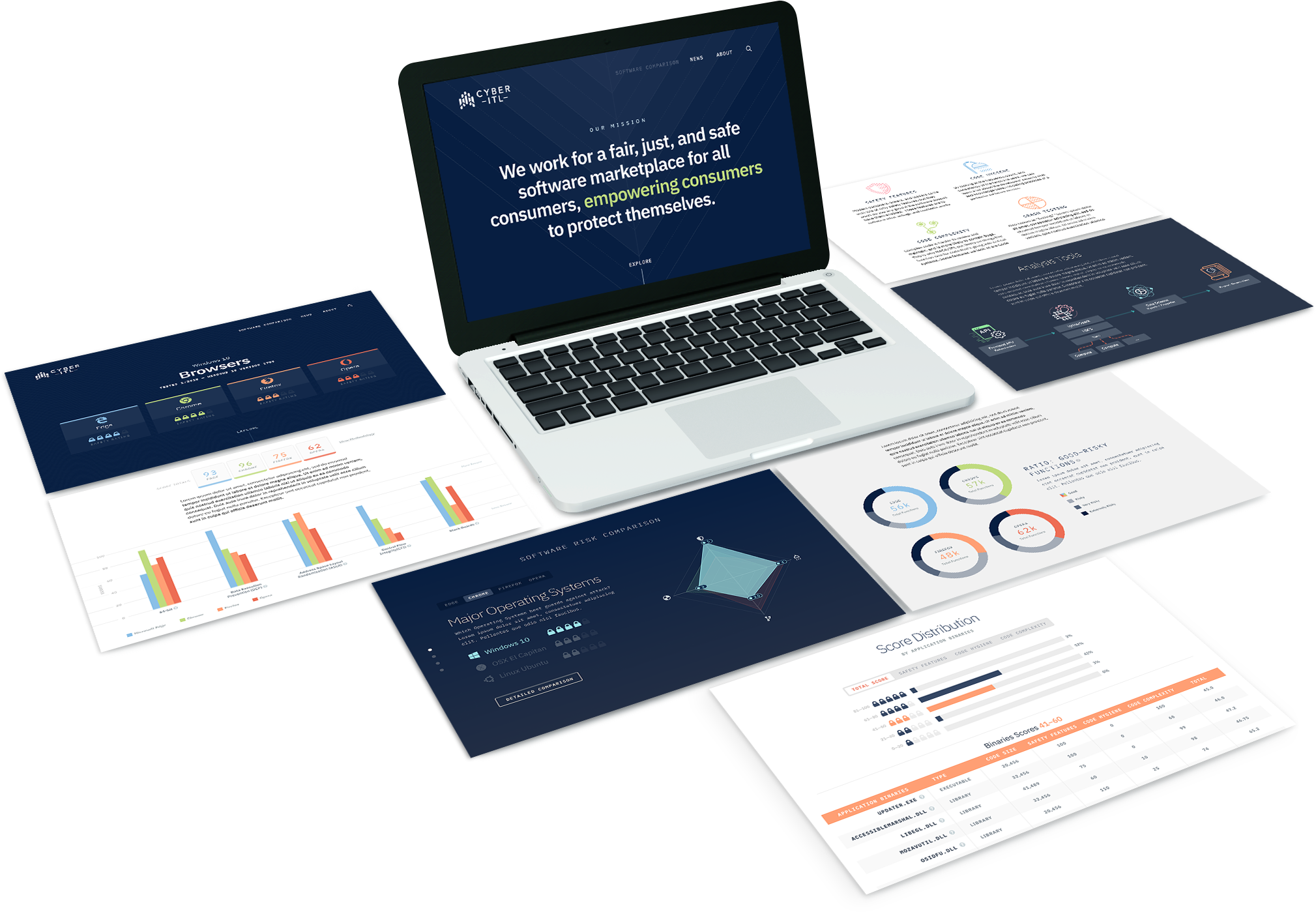
A new site structure based on user goals defined by research-validated personas, reports designed with progressive complexity, and a visual design language to communicates their goals
How We Did It
Palador's team interviewed consumers, IT Directors, CIOs and CTOs, and industry professionals and experts. As a result, we established the information hierarchy, UX design flow, data models, and technology needed to convey meaningful interactive visuals. We built out the site using HTML, Knockout, JavaScript, C3, D3, jQuery, JSON, CSS, Sass, SVG, Ruby and Jekyll, with no CMS to manage the site.
Validated Personas
Defining users based on qualititative interviews
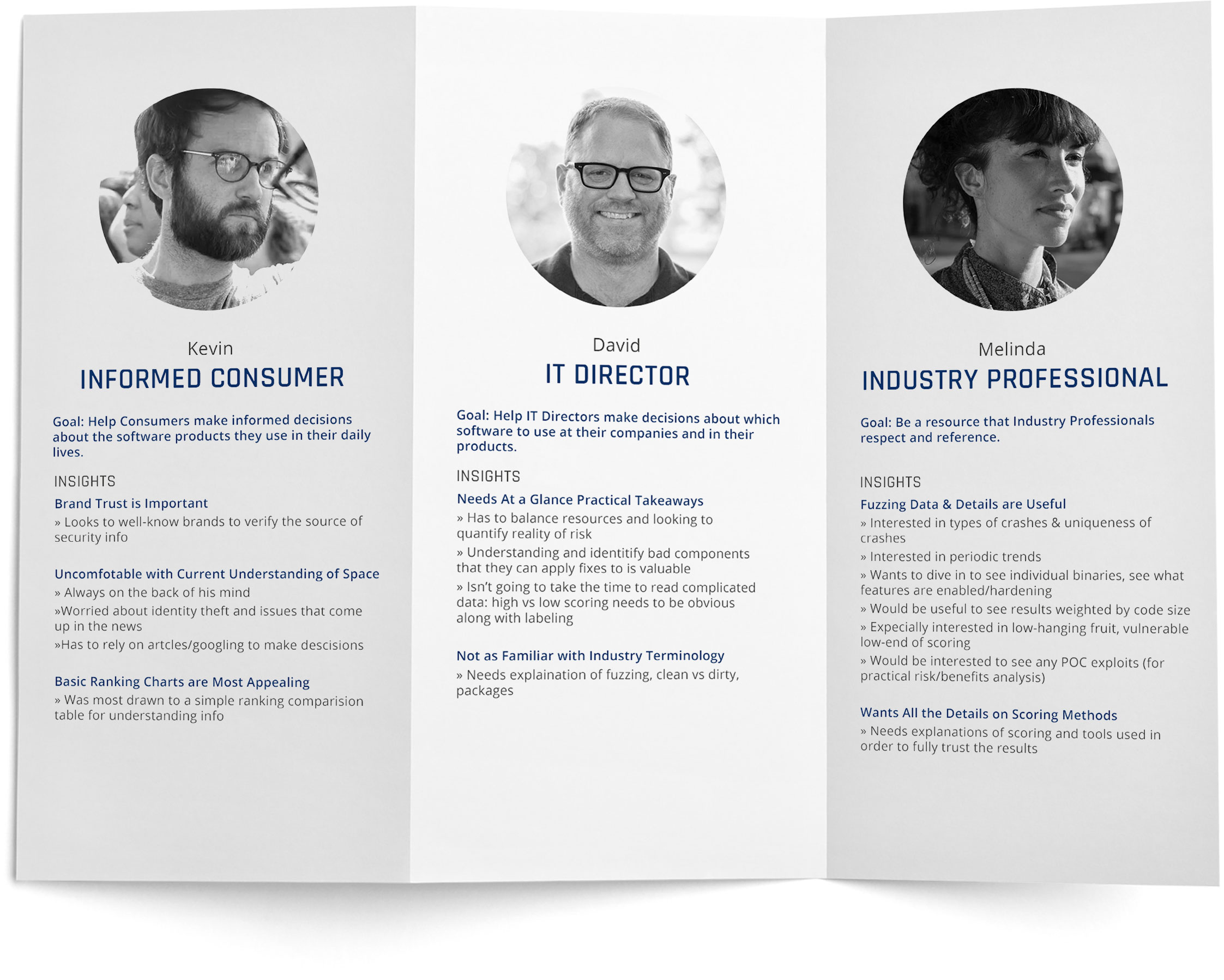
Starting with proto-personas based on information we learned from CITL about their users, we conducted user interviews with questions targeted to each persona. Analyzing the data, we found common patterns and revised our personas based on our insights. Our qualitative research process allowed us to learn more about our users’ goals, motivations, and behaviors, using more accurate information about them to create a better solution.
Branding
Creating a new visual design identity
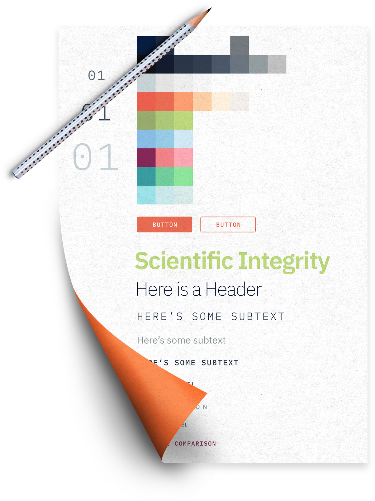
CITL’s previous website lacked a strong visual brand as they were struggling to define one. We talked in depth with them to understand their mission and how they want to be perceived in the industry. Aiming to create a brand that feels comforting and scientific, we designed a theme with a robust color palette using navy and pastels, selecting IBM Plex for the typeface. The visual design language we created was not only versatile but felt gentle, casual, and data-focused, meeting their branding goals.
Data Visualization
Incorporating interactive data
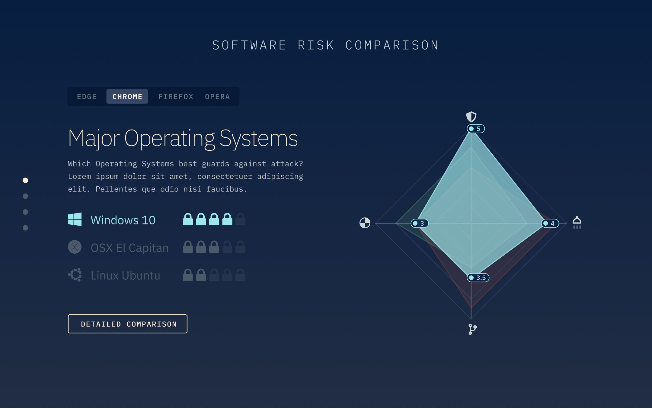
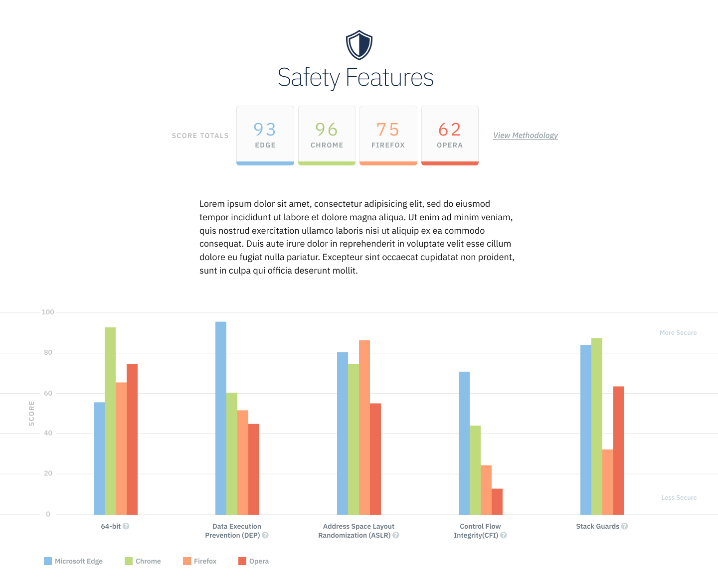
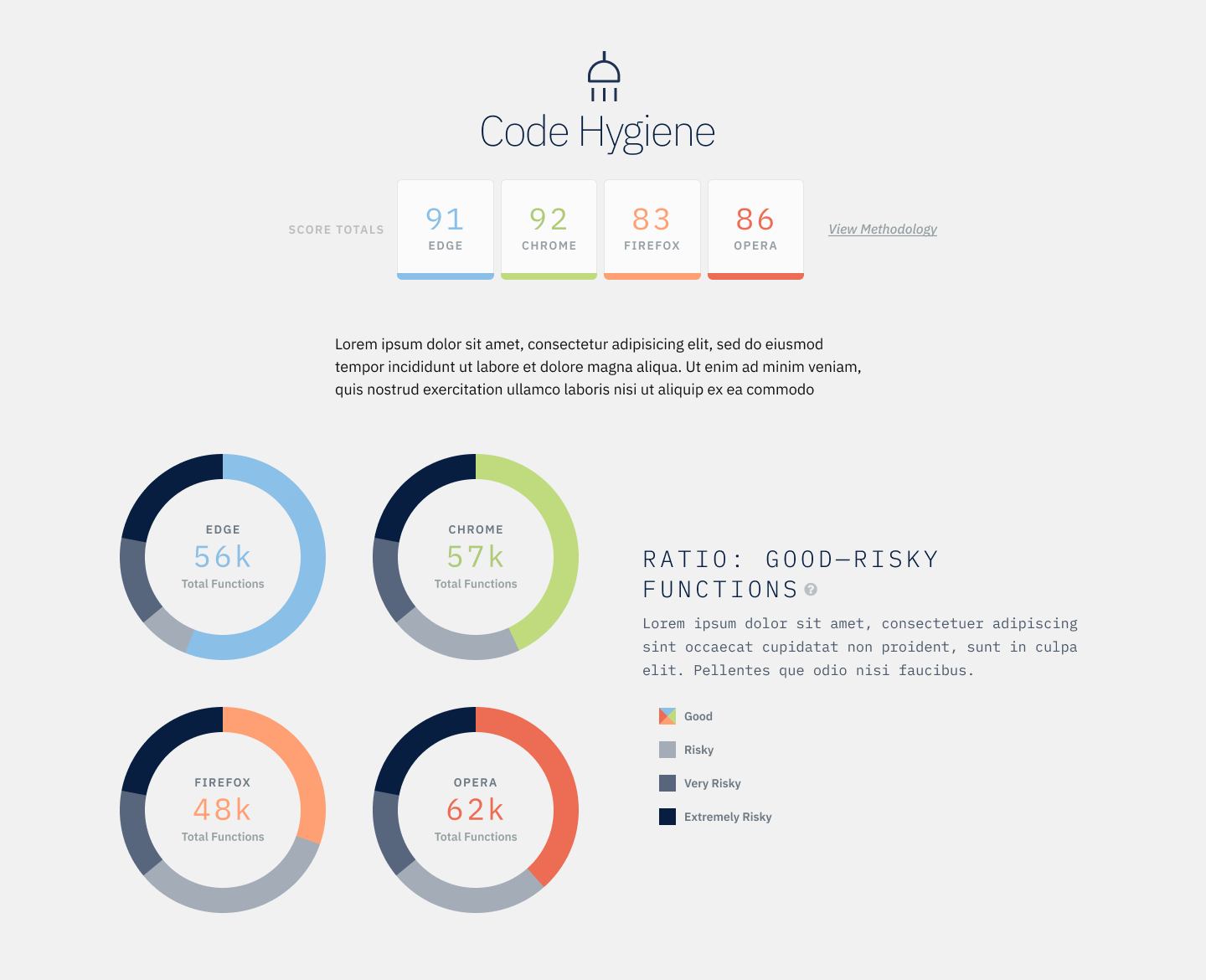
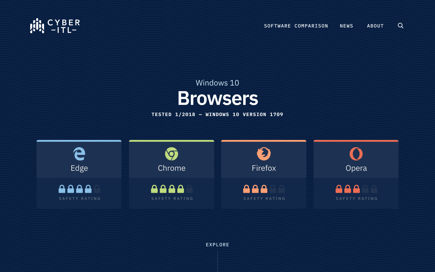
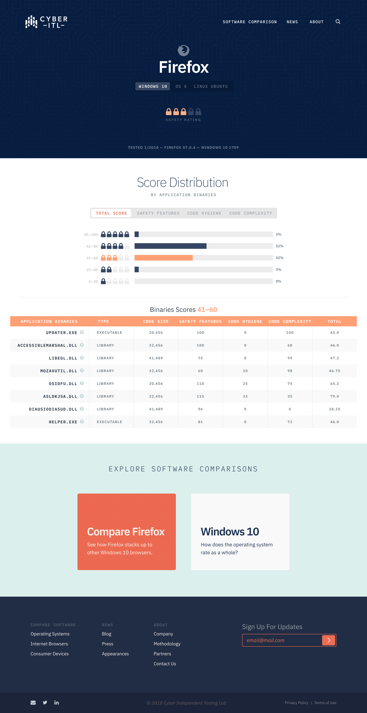
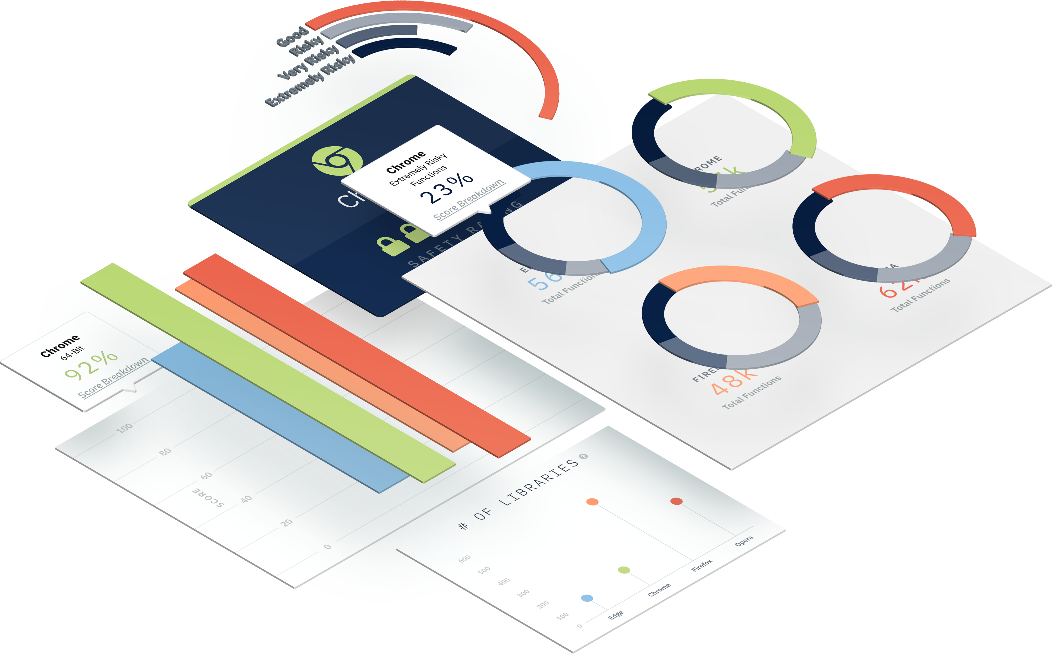
The data in CITL’s reports was overwhelmingly complex and a lot of people were confused about what kind of data was even being measured. We worked through how much detail should be introduced at the highest level, based on the information we gathered from research, and created a system of progressively granular data. Selecting the right type of graph for the purpose of each data set, we transformed the data into captivating visuals that users could interact with to glean more information.
Outcome
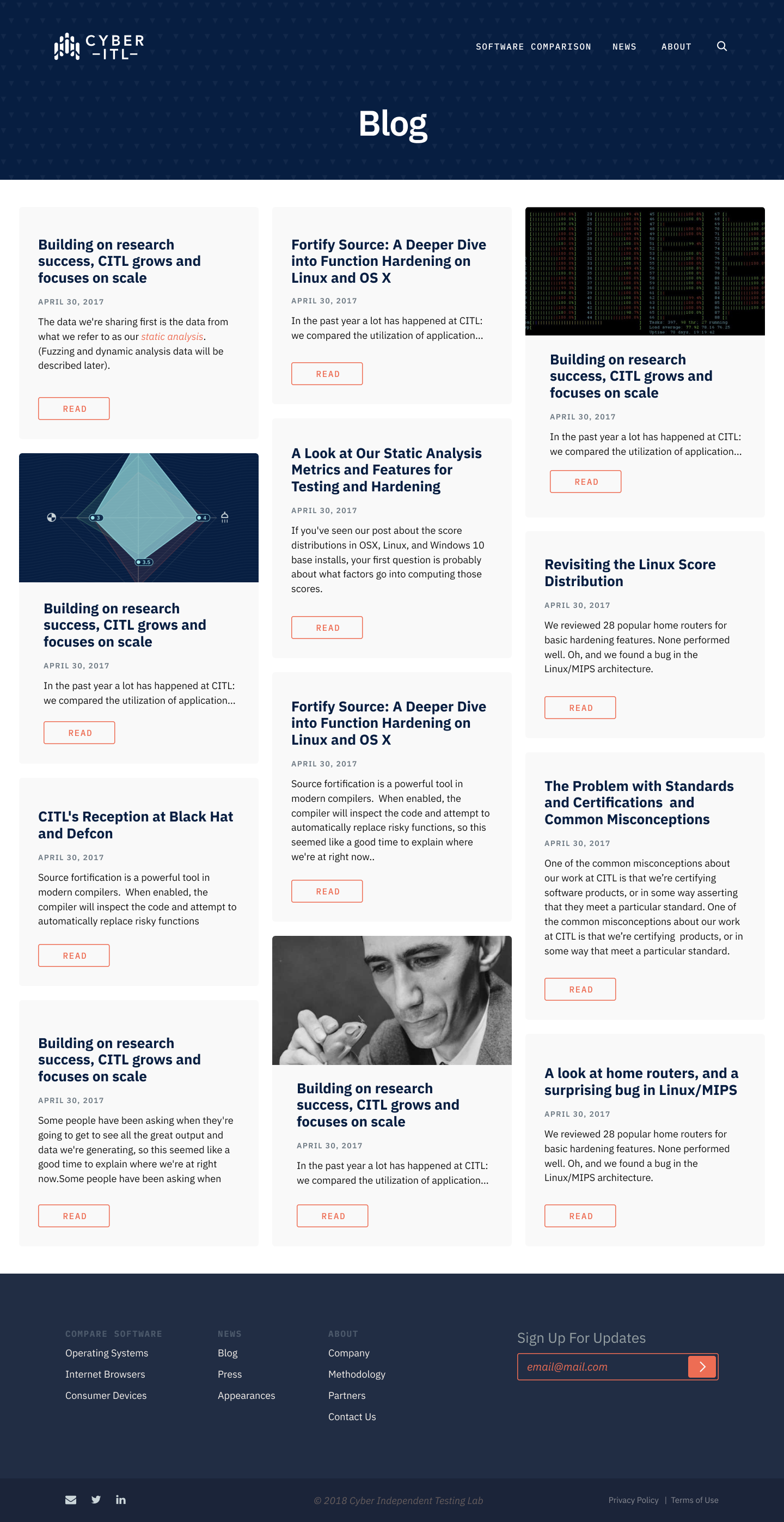
The outcome of the project was beautifully visualized data represented in a hierarchy of progressive disclosure - providing high level information first then allowing users to drill down into details as desired. Our team simplified complicated data sets into understandable representations, making study results easy to find while making full datasets available to those who wanted them. The site also provides a secure platform which CITL can make changes to on their own, as well as a brand platform where CITL can showcase their sponsors, donors, and provide news and thought leadership to their followers.
Start a Project
Need custom data visualization in your website or a new brand platform? Start that project with Palador today.

